Home Page → Individual Collection
Mobile
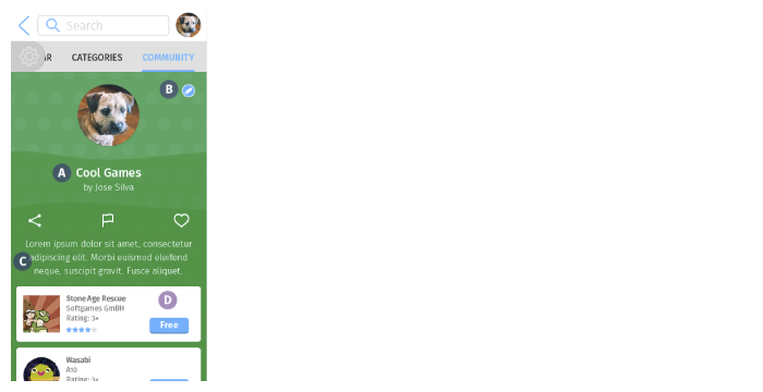
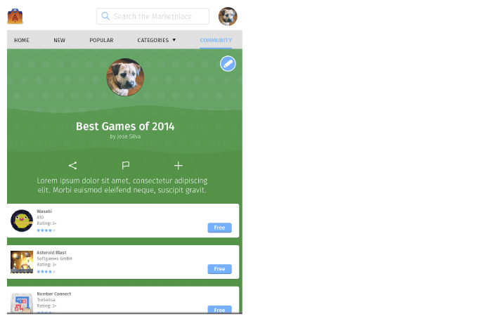
- Page Title
Collection name should appear below the user avatar. - Edit Button
- The edit button should appear where? Still unclear.
- The collection should have an edit button if the user is the creator of the collection. Otherwise, this button should not be shown.
- If the user selects "Edit", take the user to the edit collection screen.
- Collection Graphic
- Size: fill the entire screen, as tall as required
- Description: should appear below the share/flag/favorite area
- Apps – What to Show?
- Order: Apps are listed from most recently added to oldest, moving top to bottom
- Quantity: As many rows as required.
- Size of element: Each app block must always be 4 columns wide
Mobile → Flag Collection for Abuse
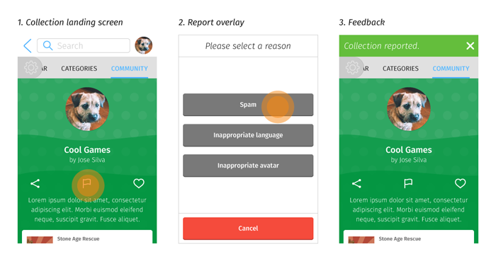
- Collection landing screen
- There should be a flag icon on the collection landing screen that allows the user to report a collection.
- The creator of a collection should not be able to report their own collection.
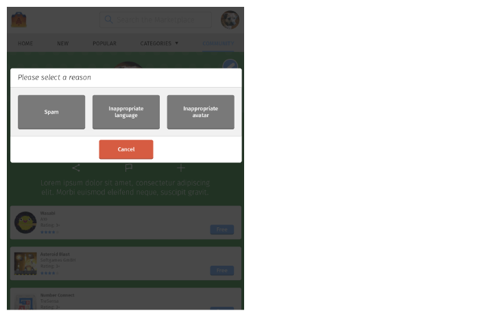
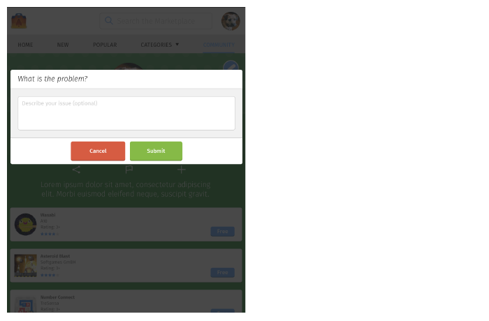
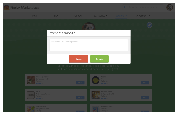
- Report overlay
When the report icon has been selected:- A an overlay should appear, asking for the reason for the report.
- The user can select whether the collection contains:
- Spam
- Inappropriate language
- Inappropriate avatar
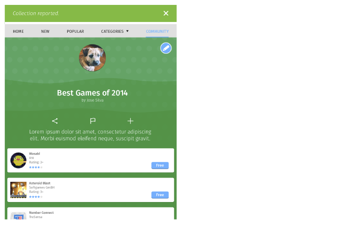
- Feedback
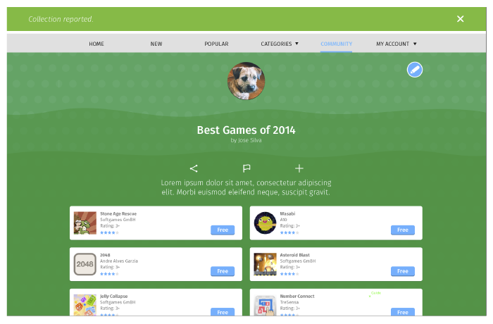
After selecting a reason, the user should return to the collection landing screen, and receive a feedback message that the reporting process was successful.
Desktop
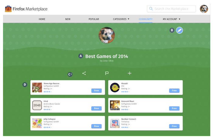
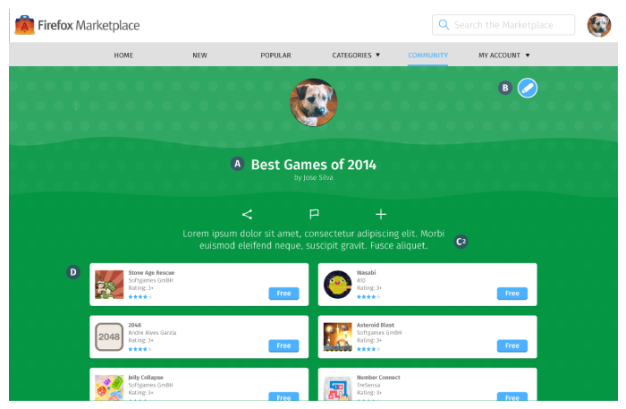
- Page Title
Collection name should appear on the top of the page. - Edit Button
The edit button should appear on the same level as the collection name. - Collection Graphic
- Size: 6 columns wide and 264 px tall.
- If collection has no description: center graphic on the center of the screen.
- If collection has description: align graphic left, align description right.
- Apps – What to Show?
Quantity: 3 blocks in one row, as many row as required.
The rest of the features are exactly the same as the Mobile layout.
Desktop → Flag Collection for Abuse
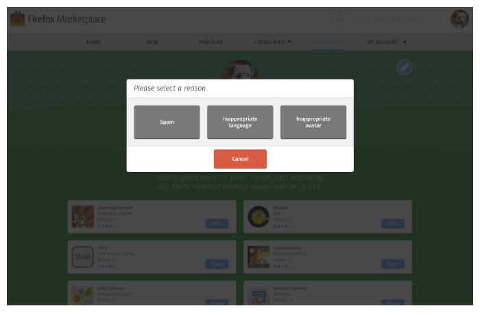
Tablet
- Edit Button
Should appear above the collection name. - Collection Graphic
The description field must always appear below the graphic, never to the side. - Apps – What to Show?
Quantity: 2 blocks in one row, as many rows as required.
The rest of the features are exactly the same as the Desktop layout.
Tablet → Flag Collection for Abuse
